

What Is Social Media UI and Why It Matters for Your Brand
Every time a potential customer lands on your brand’s social media profile, they make a judgment call. Not after reading your bio, not after scrolling through your posts — but within roughly three seconds of the page loading. That judgment is driven almost entirely by what they see, before they process a single word you’ve written.
That is social media UI at work.
For most business owners, UI — user interface — sounds like a term that belongs in a web developer’s vocabulary. But understanding it in a social media context is one of the most underrated advantages a brand can have. The businesses that get this right don’t just look professional; they build trust faster, hold attention longer, and convert casual scrollers into real customers. The ones that get it wrong bleed credibility every single day without realizing it.
This guide breaks down exactly what social media UI is, where most brands are losing ground with it, and what a strategic approach actually looks like in practice.
Defining Social Media UI: What It Actually Means for a Brand
UI, in its broadest sense, refers to the visual and interactive elements a user encounters when engaging with a digital product. In the context of social media, that definition splits into two distinct layers — and understanding both is where most marketing advice falls short.
Layer 1: Platform UI (What You Don’t Control)
Every social platform — Meta, TikTok, LinkedIn, Pinterest — operates within its own visual framework. The navigation bars, the feed structure, the button placement, the algorithmic content sequencing, the notification system — all of it is designed and controlled entirely by the platform. You cannot change it. You cannot opt out of it.
This layer is engineered to serve the platform’s goal: keeping users on the platform as long as possible. That objective is not inherently aligned with your brand’s goal of driving awareness, trust, and action. The platform UI is, in a real sense, an adversarial environment that your brand UI must work within and around.
Platform UI also changes. Instagram’s aggressive push toward full-screen Reels altered how profile grids render. TikTok’s text overlay placement zones shift with feature updates. LinkedIn periodically adjusts how article previews and post previews display in feeds. Every one of these changes can suddenly make a brand’s carefully constructed visual templates look broken, cluttered, or off-brand.
Layer 2: Brand UI (What You Do Control)
Within the constraints of the platform’s frame, every brand makes dozens of visual and structural decisions. This is your brand UI layer:
- The visual templates you use for graphics and Stories
- Your profile image and how it renders at thumbnail scale
- The color blocking, typography choices, and layout in your post graphics
- The visual rhythm of your Instagram grid or LinkedIn feed
- How your cover image or banner interacts visually with your profile image
- The hierarchy and scannability of your bio section
- How pinned posts, featured content, or highlights are structured visually
Most brands treat these decisions casually — swapping colors, testing new templates, changing posting styles with each new campaign. The result is an accumulated inconsistency that quietly erodes brand perception over time. This is what could be called UI debt: a buildup of mismatched visual decisions that makes a brand look fragmented, even when the underlying content is strong.
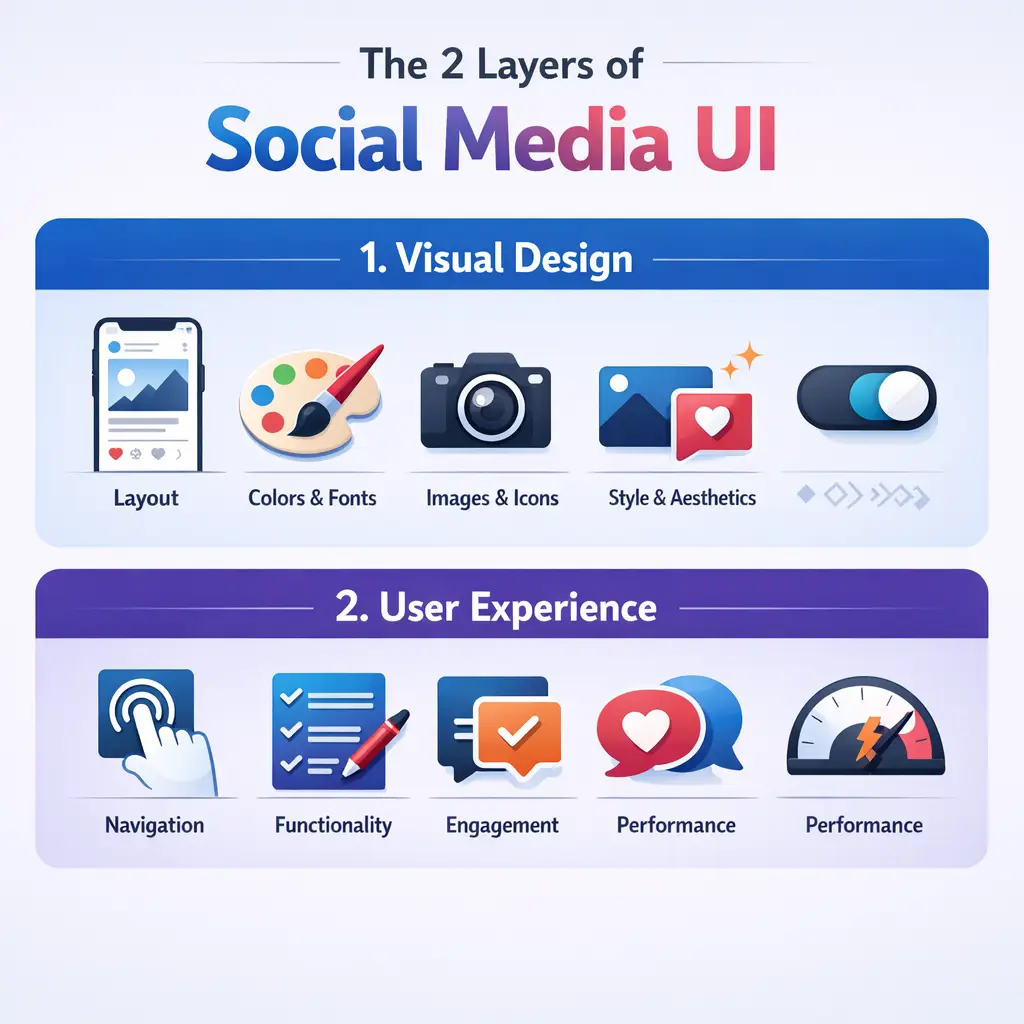
Why Social Media UI Directly Affects Brand Performance
This is where the conversation moves from design theory to business outcomes. Social media UI is not a cosmetic concern. It is a performance variable.
The 3-Second Profile Audit
Research into visual cognition consistently shows that first impressions in digital environments form in milliseconds, with meaningful credibility assessments completed within seconds. When someone lands on your brand profile — whether they were referred by a friend, clicked a paid ad, or found you through search — they run an unconscious credibility check before they engage with any content.
This assessment is driven almost entirely by UI signals:
- Profile image legibility at small sizes: Most brand logos fail the 32-pixel rendering test. At thumbnail scale, a detailed logo becomes an unreadable smudge. Strong social profile images use simplified mark versions or wordmarks designed specifically for small-format display.
- Banner-to-profile image coherence: Color temperature mismatches between a cover photo and a profile image create subconscious visual dissonance. The audience won’t articulate this — they’ll just feel slightly less confident in the brand.
- Grid or feed visual rhythm: The first nine to twelve posts visible on an Instagram profile or the first scroll of a LinkedIn or Facebook page communicate whether a brand has a coherent visual language or is making it up as it goes.
- Bio scannability: Within a single eye movement, a visitor should be able to identify what the brand does, who it serves, and why it matters. Bio sections that bury the value proposition in hashtags or generic phrases fail this test entirely.
- Pinned and featured content placement: This is the social media equivalent of above-the-fold web design. What a brand pins or features at the top of its profile tells a new visitor exactly what the brand thinks is most important. Treating this space carelessly is the equivalent of leaving the hero section of a website blank.
This three-second window is not recoverable through content quality alone. If the UI fails the credibility check, most visitors will not stay long enough to find out the content is excellent.
Cognitive Load and the Scroll Environment
Social media feeds are environments of extreme habituation. The average user scrolls through hundreds of posts, Stories, and Reels in a single session. The brain, operating primarily on what psychologists call System 1 thinking — fast, automatic, pattern-recognizing — develops efficient filters that route familiar content patterns straight to background attention.
This has a direct consequence for brand UI: if your content looks like everything else in the feed, it gets processed as background noise before the audience consciously registers it.
Effective social media brand UI is not simply about being visually polished. It is about engineering pattern interrupts — visual signals that break the brain’s automatic filtering and force a moment of conscious attention. The mechanisms that create this interrupt include:
- Unexpected color blocking that contrasts sharply with adjacent organic content
- Unusual aspect ratios or intentional whitespace that disrupts the visual flow of a feed
- Text placement that violates the expected visual grammar of the platform
- Deliberate tonal contrast — a raw, unpolished visual style can outperform highly produced content because the cognitive interrupt is stronger in a feed full of high-production posts
This explains a phenomenon many marketers observe but struggle to understand: sometimes a quick, lo-fi post dramatically outperforms a piece of content that took a full day to produce. The answer is often in the UI of the content itself, not the message or the media spend behind it.
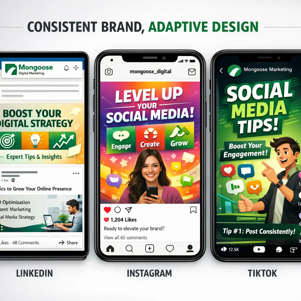
Platform-by-Platform: Social Media UI Is Not One Size Fits All
One of the most common — and most damaging — pieces of advice in this space is to “stay consistent across all your platforms.” Taken literally, this is wrong. Each major social platform has its own native UI grammar, and content that looks at home on one will look out of place on another.
The correct goal is adaptive consistency: expressing the same core brand signals through platform-native visual vocabulary. Understanding how to translate your brand identity across platforms is a core part of any social media strategy for small businesses that actually works.
| Platform | Native UI Grammar | What Brand UI Should Reflect |
|---|---|---|
| Formal, document-like, text-forward, high information density | Professional layouts, clean typography, thought-leadership framing, minimal decorative design | |
| Curated aesthetic, visual-first, high production value expectation | Cohesive grid, strong visual templates, brand color system, Story design consistency | |
| TikTok | Raw, immediate, lo-fi authenticity, entertainment-first | Minimal brand overlay, natural lighting, on-screen text that matches platform caption conventions |
| Hybrid text and visual, community-oriented, varied content formats | Flexible templates that work across image, video, and link preview formats | |
| Aspirational, vertical-format, search-driven discovery | Tall graphics (2:3 ratio), high-contrast text overlays, seasonal and topical visual theming | |
| X (Twitter) | Text-primary, real-time, high information throughput | Minimal graphic design, sharp and scannable typography when images are used |
A brand that imports identical visual templates across all six of these platforms will look strategically coherent on perhaps one of them — and visually tone-deaf on the rest. The LinkedIn audience is accustomed to formal, information-rich design; an Instagram-style graphic with bold color washes and minimal text will read as shallow. The TikTok audience has trained itself to distrust overproduced brand content; heavy design overlays signal inauthenticity immediately.
Understanding these distinctions is not optional for brands that want their social media investment to generate real return.
Accessibility: The Social Media UI Factor Most Brands Ignore Entirely
A high-performing brand UI is one that every member of your target audience can actually use and consume. Accessibility is not a compliance checkbox — it is a reach multiplier.
The key accessibility dimensions that directly affect social media UI performance include:
- Color contrast ratios on text overlays: WCAG (Web Content Accessibility Guidelines) recommends a minimum contrast ratio of 4.5:1 for normal text. Many branded graphic templates, particularly those using light-colored text on pastel backgrounds, fail this threshold — meaning a meaningful portion of your audience cannot comfortably read your content.
- Caption and subtitle readability: Video content without captions is inaccessible to users with hearing impairments and to the significant percentage of users watching in silent environments. Captions are also a UI element — their typography, placement, and contrast are brand decisions.
- Alt-text as a UI layer: Platform alt-text features are systematically underused by brands. Beyond serving screen reader users, well-written alt-text also contributes to how platforms index and categorize your content.
- Mobile rendering across device types: Dark mode, varied screen sizes, notch placement, and system font scaling all affect how your carefully designed templates actually appear on real devices. A template that looks perfect in a design file may render with clipped text or distorted proportions on a mid-range Android device.
Brands that treat accessibility as a design constraint rather than a performance variable are leaving a measurable portion of their potential audience behind — and often don’t have the data to see it happening.
The Concept of UI Debt: How Inconsistency Compounds Over Time
Every time a brand makes an undisciplined visual decision on social media — a post that uses an off-brand color, a Story created in a mismatched template, a video thumbnail that breaks the grid aesthetic — it deposits a small amount of visual inconsistency into the account. Individually, these decisions feel inconsequential.
Over weeks and months, they accumulate into what practitioners recognize as UI debt: a backlog of inconsistent creative choices that collectively degrade brand perception without any single cause being easy to identify.
The symptoms of high UI debt on a social media account include:
- Audience trust erosion: Profiles that look visually inconsistent communicate organizational inconsistency, even to audiences who cannot name what they’re responding to
- Reduced content performance baseline: Content from brands with inconsistent UI tends to underperform against accounts with strong visual systems, independent of content quality, because the platform algorithm weighs engagement history and follower behavior patterns that are influenced by UI consistency
- Increased creative production friction: Without a clear visual system, every piece of content requires a new design decision — multiplying time and cost across every posting cycle
- Weaker influencer and partnership leverage: Brands with inconsistent UI are harder for collaborators to co-brand with, reducing partnership opportunities
Addressing UI debt requires a deliberate audit — reviewing the last three to six months of published content, identifying where the visual language drifted, and establishing a documented UI system that governs future creative production.
What a Strong Social Media UI System Actually Looks Like
Building a defensible social media brand UI is not a one-time design project. It is a system — a documented set of decisions that governs every visual choice across every platform, updated deliberately rather than reactively.
The core components of a functional brand UI system for social media include:
Visual Identity Adapted for Platform Rendering
– Primary logo, simplified logo mark, and any platform-specific variants
– Profile image files tested at 32px, 60px, and 180px display sizes
– Color palette with documented hex values, contrast-tested for overlay use
Template Architecture
– Post templates for each platform, built within native aspect ratios
– Story and Reels templates with safe zones accounting for platform UI chrome
– Thumbnail systems for video content, consistent across series
Typography System
– Primary and secondary typefaces with defined use cases
– Font size hierarchy for graphic text that remains legible at mobile scale
Grid and Feed Strategy
– Defined posting cadence and content type ratio
– Grid planning approach for image-forward platforms
– Pinned content policy with regular review schedule
Accessibility Standards
– Minimum contrast ratios enforced across all templates
– Caption policy for all video content
– Alt-text standard for all image posts
Platform Update Response Protocol
– Process for auditing template library when platform UI changes are announced
– Stakeholder sign-off required before templates are retroactively updated
This is the infrastructure that separates brands with genuine social media presence from brands that are simply posting. The difference shows up directly in lead quality, follower retention, and the rate at which content converts attention into action. Selecting the right tools to manage this system is equally important — our guide on how to choose social media management software walks through what to evaluate before committing to a platform.
How Mongoose Digital Marketing Approaches Social Media UI
At Mongoose Digital Marketing, we treat social media UI as a foundational element of every social strategy we build — not an afterthought, not a rebrand exercise, but a core performance lever that affects results from day one.
Our approach starts with a detailed audit of a brand’s existing social presence across all active platforms: identifying UI debt, assessing platform-native alignment, and evaluating how the current visual system performs against real audience behavior data. From there, we build a customized UI framework that reflects the brand’s identity, meets accessibility standards, and is designed to stay coherent as platform environments evolve.
Every brand we work with is different. A regional service business in a competitive local market has different UI priorities than an e-commerce brand targeting a national audience. Our strategies reflect those differences — because a template built for someone else’s brand is not a strategy built for yours.
If your brand is ready to stop leaving first impressions to chance, we offer a free consultation to assess where your social media UI stands and what a stronger visual system would mean for your growth. The businesses that build this foundation now are the ones that compound it into a real competitive advantage over time.
Strategic Recommendations for 2026
As social media platforms continue to evolve their native UI environments — and as audiences become increasingly sophisticated about recognizing low-effort content — the brands that invest in their visual infrastructure now will hold a compounding advantage through the next cycle of platform changes. Here are three specific recommendations to strengthen your social media UI strategy heading into 2026.
1. Adopt a Platform-Native Design Workflow Using Figma with Component Libraries
Generic design tools produce generic results. In 2026, the standard for social UI management is a Figma-based system with platform-specific component libraries that are updated as platform specs change. This approach allows your team — or your agency — to build new content against live constraints rather than retrofitting after the fact. Frames sized correctly, safe zones respected, type hierarchy enforced at the template level. This is how brands with high content volume maintain coherence without sacrificing speed.
2. Integrate a Social Media Management Platform with Visual Preview Capabilities
Tools like Later, Sprout Social, or Buffer have matured significantly in their visual planning functionality. For 2026, the recommendation is to use whichever platform gives your team a true visual preview of how content will render in-feed before it publishes — not just a content calendar, but a genuine representation of how your brand’s grid, Story sequence, or Reel thumbnail stack will actually appear to a follower. This closes the gap between what you design and what your audience sees.
3. Schedule a Formal UI Audit at Least Once Per Quarter
Platform UI changes are no longer rare events — they are a routine part of operating on social media. A quarterly audit of your template library, profile structures, and accessibility compliance is not optional infrastructure for brands that take their digital presence seriously. Build the audit into your content operations calendar now, before a platform update forces a reactive scramble that interrupts publishing momentum and introduces brand inconsistency at the worst possible moment.
Frequently Asked Questions
What exactly is social media UI and how is it different from branding?
Social media UI refers to the specific visual and structural elements that shape how your brand appears and functions within social media platforms — things like profile layout, post formatting, thumbnail design, Story templates, and how your content renders in a follower’s feed. Branding is the broader system of identity: your colors, fonts, tone, and values. Social media UI is where that brand identity gets translated into platform-specific execution. A brand can have a strong identity on paper and still have a weak social media UI if that identity isn’t being applied consistently and correctly to each platform’s native environment.
Why does social media UI matter for lead generation and conversions?
First impressions on social media happen in fractions of a second. Before a potential customer reads your caption, clicks your link, or considers your offer, they have already made a subconscious judgment about your brand based on what they see. A disorganized, inconsistent, or visually dated UI signals low credibility — even if the underlying product or service is excellent. Brands with strong social media UI create the visual trust that makes audiences more likely to engage, follow, and eventually convert. It is not decoration; it is the environment in which every piece of content either earns attention or loses it. For a broader look at how social presence translates into real business results, the article on social media marketing for small businesses that works covers the full picture.
How often should a brand update its social media UI templates?
At a minimum, brands should review their social media UI templates on a quarterly basis and conduct a full audit any time a major platform announces significant UI changes — which happens multiple times per year across platforms like Instagram, TikTok, LinkedIn, and Facebook. Beyond platform-driven updates, brands should also revisit their templates when launching a new campaign, entering a new market, or making meaningful changes to their overall brand identity. The goal is not constant redesign; it is a living system that stays current without losing the visual coherence your audience has come to recognize.
Can a small or local business benefit from investing in social media UI?
Absolutely — and in many cases, the competitive advantage is even more pronounced at the local level. Most small businesses are operating with inconsistent visuals, outdated profile structures, and templates that do not reflect their actual brand identity. A local business that invests in a clean, professional, platform-native social media UI immediately stands out in a feed dominated by competitors who have not made that investment. For service-area businesses competing on trust and local reputation, the visual signal of a well-managed social presence can be one of the highest-leverage steps toward consistent lead generation.
Conclusion
Social media UI is one of those areas where the right foundation makes everything else in your strategy perform better — and Mongoose Digital Marketing’s social media management and content strategy services are built around getting that foundation right for your specific brand, market, and growth goals. If you’re ready to close the gap between where your social presence is and where it needs to be, the next step is a straightforward conversation. Contact Mongoose Digital Marketing to get a free assessment and find out what a stronger visual system could mean for your brand’s results.