

Key Takeaways
- A company website’s primary job is not to look impressive — it is to move a specific visitor from uncertainty to a confident decision, and every design element should be evaluated against that standard.
- Navigation structure is the single most consequential architectural decision in company website design, yet it receives less strategic attention than color palettes or hero images.
- Generous white space is not a stylistic preference; it is a positioning signal that communicates market tier and directly affects whether high-value prospects continue reading or leave.
- B2B company websites must accommodate multi-session, multi-stakeholder evaluation behavior — a reality that changes where social proof is placed, how services are described, and how conversion paths are structured.
- A website that performs consistently is maintained as a living system with ongoing analytics, heatmap review, and iterative testing — not treated as a finished product at launch.
Most company websites in the Dayton area follow the same unspoken formula: pick a clean template, load in the logo and service list, add a contact form, and call it done. The result looks professional enough in a screen recording demo. Then traffic arrives — or doesn’t — and the phone stays quiet.
The frustrating part is that the problem isn’t obvious from the outside. The site looks like it should work. The colors are consistent. The photography is decent. The copy explains what the company does. And yet the site produces almost nothing in terms of qualified inquiries, demonstrable pipeline contribution, or measurable growth.
This is the central problem with how most businesses approach website design: they optimize for the design review meeting, not for the behavioral reality of their actual visitors.
This article is a practitioner-level breakdown of what actually drives performance in company website design. We’re not covering template libraries or color theory basics. We’re covering the strategic frameworks, psychological mechanisms, and structural decisions that separate a site that reads well from one that functions as a growth asset — consistently, measurably, and on behalf of the specific business goals of companies operating in markets like Dayton, Kettering, Beavercreek, and across the greater Miami Valley.
The Fundamental Misframe: Aesthetics vs. Architecture
The design industry — and a significant portion of the web content written about company website design — frames the subject as a visual discipline. Inspiration galleries dominate search results. Award sites celebrate motion design and creative layout. The implicit message is that better-looking equals better-performing.
That framing is wrong in a specific, costly way.
Visual quality matters as an entry condition. A site that looks outdated, inconsistent, or cheap fails a threshold credibility test before a visitor reads a single word. But once you clear that threshold — and clearing it is not especially difficult with modern design tools — additional aesthetic investment produces rapidly diminishing returns. The variables that actually drive lead generation, time-on-site, return visits, and conversion are structural and psychological, not visual.
Understanding this distinction changes every design decision you make. It shifts the question from “does this look good?” to “does this do the right job at the right moment in a visitor’s decision process?”
What “Doing a Job” Means in Website Design
Every page element on a company website has a job. A headline’s job is to confirm relevance and earn the next line of reading. An image’s job is to reduce abstraction and build identification. A testimonial’s job is to eliminate a specific category of doubt. A call-to-action’s job is to make the next step feel obvious and low-risk.
When design is treated as visual decoration, elements get placed based on what looks balanced. When design is treated as a functional discipline, elements get placed based on what a visitor needs at that specific moment in their evaluation process — and sequenced accordingly.
The distinction sounds abstract until you start reviewing session recordings of real visitors on real company websites. Visitors don’t read pages the way designers present them. They scan, jump, scroll back, leave, return from a different device two days later, and finally convert — or don’t — based on an accumulated impression formed across multiple exposures. Designing for that reality requires a fundamentally different approach than designing for a static mockup that looks great in Figma.
Trust Architecture: The Psychological Sequence Every Company Website Must Navigate
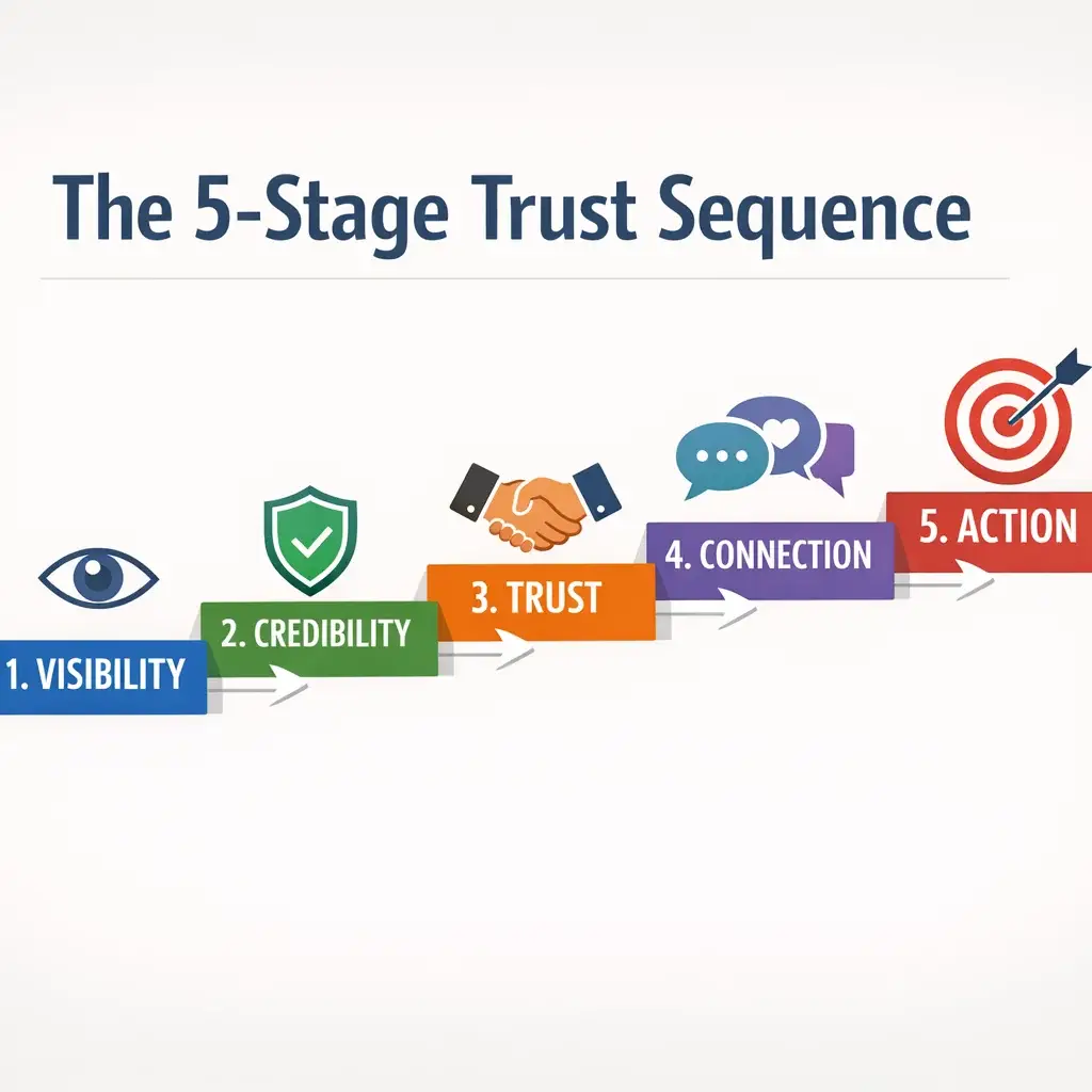
One of the most consistently underdiscussed concepts in company website design is the trust sequence — the ordered set of psychological checkpoints a first-time visitor moves through before they take any action, including the action of continuing to read.
This sequence is not random. Research in consumer psychology and UX behavior consistently shows that visitors evaluate websites in a predictable hierarchy before they commit cognitive effort to the content itself:
- Visual credibility — Does this site look like it belongs to a real, established company? This assessment happens in under 200 milliseconds and is almost entirely subconscious.
- Relevance signal — Is this company solving a problem I actually have? Visitors make this determination from the hero section headline and the first paragraph of visible body copy. If the relevance signal fails, the session ends.
- Social proof — Have people like me trusted this company, and did it work out? This is the phase where testimonials, client logos, case study references, and review counts carry weight.
- Risk reduction — What’s the downside of engaging? Visitors at this stage are actively looking for friction — long-term contracts, unclear pricing structures, vague service descriptions, or any other signal that commitment carries hidden cost.
- Action trigger — Is the next step obvious and proportionate to where I am in my decision process? A call-to-action that asks for too much too early (e.g., “Buy Now” on a first visit to a B2B professional services site) will fail even when the visitor is otherwise interested.
The strategic implication of this sequence is that every page layout decision is also a sequencing decision. Where you place your testimonials relative to your service descriptions matters. Whether your hero section headline addresses relevance or just names the company matters. Whether your primary CTA says “Get a Quote” or “Schedule a Free Consultation” matters — not aesthetically, but functionally.
Micro-Credibility Signals: The Details That Determine Whether Visitors Keep Reading
Beyond the primary trust sequence, company websites succeed or fail on what we call micro-credibility signals — small, individually unremarkable details that collectively determine whether a visitor’s subconscious flags the site as trustworthy or questionable.
These include:
- Typography consistency — Mismatched font weights, inconsistent heading sizes, or body copy that shifts style between pages reads as disorganized at a subconscious level, even when a visitor couldn’t articulate why the site feels “off.”
- Image authenticity — Stock photography of smiling generic professionals consistently underperforms authentic team and facility photography in B2B contexts. Visitors don’t consciously identify the images as stock; they simply fail to build the identification response that authentic imagery produces.
- Favicon presence and quality — A missing or low-resolution favicon is a surprisingly reliable signal that a site hasn’t been maintained to professional standards. In multi-tab browsing environments — which describes the majority of B2B research sessions — your favicon is your visual identity in the browser chrome.
- Mobile rendering fidelity — A site that wraps text awkwardly, breaks layout on tablet viewports, or requires horizontal scrolling on mobile creates an immediate credibility gap. In 2024, poor mobile rendering doesn’t just damage UX — it signals organizational inattention to detail.
- Page load behavior — Content that shifts as it loads (Cumulative Layout Shift, one of Google’s Core Web Vitals) creates a physical discomfort response in users. Even visitors who don’t consciously notice it tend to leave sooner and return less.
For companies in competitive local markets — including professional services, construction, healthcare administration, and B2B manufacturing suppliers common in the Dayton-Kettering corridor — these micro-signals often represent the margin between a visitor who engages and one who quietly moves to the next result.
White Space as Positioning: Why Layout Density Communicates Market Tier
Walk through a high-end financial advisory firm in Centerville and then visit a discount tax preparation chain. Before a single word is spoken, the spatial experience of each environment sends a clear signal about the clientele each business expects to serve.
Website layout operates on the same principle.
Generous white space — adequate margins, breathing room between sections, deliberate pacing through the page — is consistently associated with premium market positioning in web design research. Cramped, information-dense layouts correlate with value-tier positioning. This isn’t a subjective aesthetic call. It’s a learned cultural association that your visitors bring to every page they view, including yours.
This has a direct strategic implication for companies in professional services, B2B technology, consulting, and specialty manufacturing: if you’re competing for higher-value engagements, your layout density needs to signal the market tier you’re targeting, not the one you’re trying to move away from.
The Cognitive Load Connection
Beyond positioning, layout density has a direct measurable effect on visitor behavior through cognitive load theory. When a page presents too many competing visual elements simultaneously — multiple CTAs, dense text blocks, overlapping images, animated elements, and competing color emphasis — the brain’s working memory fills up. The subjective experience for the visitor is not “this site has a lot of information.” It is “I don’t know what I’m supposed to do here.” Decision fatigue sets in, and the easiest decision available is to leave.
This is the cognitive load → decision fatigue → abandonment chain in practice. It explains why some visually sophisticated sites — pages with high design investment — still produce poor session metrics. The design looks impressive but asks the visitor to do too much cognitive work simultaneously.
The fix is not simplification for its own sake. It is prioritization: deciding, for each page section, what the one intended action or perception is, and designing the layout to support that single outcome rather than trying to accomplish everything at once.
Auditing Your Layout for Positioning Alignment
A practical framework for assessing whether your current site layout is working for or against your market positioning:
| Layout Characteristic | Premium/Enterprise Signal | Value-Tier Signal |
|---|---|---|
| Margin width | Wide margins, content centered at 60–70% viewport width | Edge-to-edge content, minimal margins |
| Section spacing | Generous vertical space between page sections | Compressed sections, content stacked tightly |
| Call-to-action density | One primary CTA per section, clearly differentiated | Multiple CTAs competing visually in same section |
| Typography scale | Large heading hierarchy, deliberate type sizing | Small or inconsistent type with little hierarchy |
| Image usage | Fewer, larger images used purposefully | Many small images filling space |
| Color deployment | Limited accent color, used to direct attention | Multiple accent colors competing for focus |
| Animation | Subtle or absent; used only when it aids comprehension | Frequent motion effects, autoplay elements |
| Navigation density | Clean, limited primary navigation items | Overloaded navigation with many top-level items |
Review your current site against this table honestly. If you find your layout consistently falling in the right column while your business development goals target enterprise or premium-segment clients, your design is actively working against your positioning — regardless of how much was invested in building it.
Navigation Architecture: The Most Consequential Decision Nobody Talks About
If you ask most business owners what they think about when designing their company website navigation, the answers tend to cluster around: “We listed all our services,” “We included an About page,” and “We made sure people could find the contact page.”
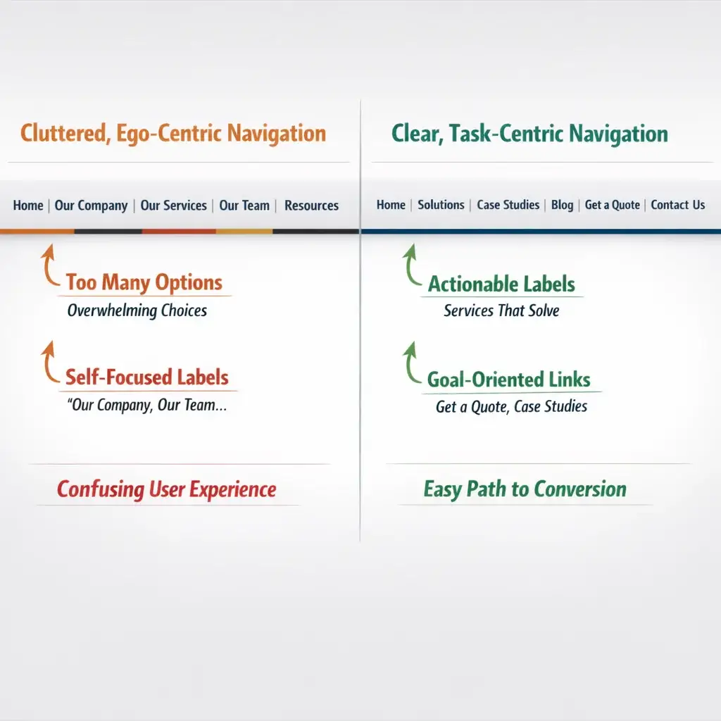
That’s ego-centric navigation — menus structured around the company’s internal organization, department names, or service categorizations that make complete sense internally and often communicate very little to a first-time visitor trying to figure out whether this company can solve their specific problem.
The alternative is task-centric navigation: menus structured around what visitors are trying to accomplish when they land on your site, not around how your organization describes itself internally.
The performance difference between these two approaches is significant. Research on navigation behavior consistently shows that when navigation labels match the visitor’s mental model — the language they use to describe their own problem — they navigate more efficiently, stay longer, and convert at higher rates. When navigation labels reflect internal company vocabulary that visitors haven’t yet adopted, friction accumulates on every click.
Practical Examples from Common Company Structures
Consider a Dayton-area commercial HVAC company. Ego-centric navigation might look like:
- Home | Our Services | Our Team | Industries We Serve | About Us | Contact
Task-centric navigation restructured around visitor intent might look like:
- Home | Facilities Over 10,000 Sq Ft | Emergency Service | Preventive Maintenance | Why Mongoose HVAC | Get a Site Assessment
The second structure immediately signals relevance to different visitor types, uses the language buyers use when describing their own situations, and reduces the cognitive step of translating “Our Services” into “what I actually need.”
This principle applies across industries — professional services, B2B technology, healthcare administration, specialty retail — wherever a first-time visitor arrives with a specific problem and needs to quickly determine whether this is the right company to solve it.
The 3-Click Myth and What Actually Matters
Web design mythology holds that any page should be reachable within three clicks from the homepage. This rule has been repeated enough times that it’s become a standard against which navigation depth is measured.
The research, however, shows that click count is not the primary driver of perceived navigation friction. Label clarity is. Users in controlled studies will complete six or seven clicks through clearly labeled, logically sequenced navigation without frustration. The same users abandon navigation paths at two or three clicks when labels are ambiguous or don’t match their mental model of what they’re looking for.
The design implication is significant: optimizing for shallow click depth while using vague navigation labels produces a worse experience than deeper navigation with precise, task-oriented labels. If restructuring your navigation means adding a level but dramatically clarifying where each path leads, the additional click is not a problem — the gained clarity is a measurable improvement.
Navigation Structure and SEO Crawl Efficiency
A point that gets almost no attention in general discussions of company website design: navigation architecture directly affects how efficiently search engine crawlers index your site’s content.
Internal link structure — which is substantially determined by navigation — signals to search crawlers which pages are most important, how content is topically related, and how frequently they should return to reindex specific sections. A company website with flat, logical navigation that passes link equity efficiently through internal links will, over time, outrank a technically equivalent site with disorganized navigation and orphaned pages — not because of any single navigation decision but because the cumulative indexing efficiency compounds over months and years.
For companies in competitive local markets across the Miami Valley, this is not a theoretical SEO benefit. It is a practical competitive edge that accrues over the lifecycle of the site. Our article on web design best practices for SEO in 2026 covers how these structural decisions connect directly to search visibility for local businesses.
Design-to-Business-Outcome Mapping: Aligning Every Decision to a Goal
One of the most consistent failures in company website design is the absence of a clear mapping between specific business objectives and specific design decisions. The site is built, it reflects the brand, and then it is expected to “generate leads” as a generalized function — with no architectural distinction between pages meant to capture awareness-stage visitors and pages meant to convert consideration-stage prospects who’ve returned for a third time.
Different business goals require fundamentally different design responses. The table below maps common company objectives to the design and content architecture decisions that support them:
| Business Objective | Primary Audience | Key Design Decisions |
|---|---|---|
| Lead generation | Prospects early in problem awareness | Educational content-forward layout; CTAs that offer value (guides, assessments, consultations) before asking for commitment; clear trust signals near primary conversion elements |
| Investor relations | Financial stakeholders, board-level | Controlled information hierarchy; data visualization; formal typography; restrained color palette signaling stability and precision |
| Talent acquisition | Job candidates across seniority levels | Culture-forward imagery; employee voice content; career progression signaling; transparent values presentation |
| Partner/vendor development | Potential channel partners and referral sources | Capability demonstration over service promotion; case study emphasis; partnership process transparency |
| Enterprise account development | Committee-driven B2B buying groups | Multiple stakeholder content paths; technical depth available on demand; extensive social proof from comparable organizations; low-friction gated content |
| Local market authority | SMB and mid-market buyers in defined geography | Local social proof (area-specific clients, regional project references); community credibility signals; geographically grounded case studies |
Most company websites in markets like Beavercreek, Miamisburg, Springboro, and Huber Heights are trying to accomplish several of these objectives simultaneously — which is entirely legitimate. But the mistake is building a single undifferentiated homepage experience and expecting it to serve all of these audiences with equal effectiveness.
The strategic response is audience-aware page architecture: a homepage that identifies visitor types and directs them efficiently to the content path designed for their specific situation, rather than a single narrative that tries to speak to everyone and ends up connecting fully with no one.
The B2B Buyer Journey: Designing for Multi-Session, Multi-Stakeholder Reality
For B2B companies — which describes a significant share of the business landscape in the Dayton metro, including logistics, manufacturing support, professional services, and technology — the website’s role in the sales process is fundamentally different from consumer retail.
B2B purchase decisions, particularly at contract values that justify dedicated business development, rarely resolve in a single session. Research from Gartner and other enterprise research organizations consistently shows that B2B buyers complete 57–70% of their purchase evaluation before initiating direct contact with a vendor. They visit the site multiple times. They share specific pages with colleagues. Different stakeholders — technical evaluators, financial approvers, operational end-users — each visit the site looking for different information.
This reality has direct implications for company website design that most businesses, and most design agencies, fail to address:
Multi-session considerations:
– Navigation and page URLs must be clean enough that a page shared via email or Slack resolves cleanly on revisit
– Content depth must reward a third or fourth visit as much as a first — meaning the site can’t be exhausted in a single session
– Retargeting integration with the website means that first-session behavior should be captured and used to serve more relevant content on return visits
Multi-stakeholder considerations:
– Technical service descriptions and operational case studies need to be findable without being the only content available — so the financial approver who visits first doesn’t land on a page that immediately assumes technical fluency
– Testimonials and case studies should represent different stakeholder perspectives — not just the end-user satisfaction story, but the business outcome story that a financial decision-maker finds credible
– Contact and inquiry mechanisms should offer more than one path — a detailed inquiry form for the considered buyer ready to engage, and a lower-friction “ask a question” mechanism for the stakeholder who needs one specific answer before sharing the site internally
Website Design as a Continuous System, Not a Launch Event
The final strategic concept that separates high-performing company websites from well-designed underperformers is this: a website is never finished.
Treating a website launch as the completion of a project — the point at which the design is “done” and the business returns to other priorities — is the single most common and costly mistake companies make after investing in professional website design.
What happens after launch determines the majority of the site’s long-term value. Specifically:
- Heatmap and session recording analysis reveals how actual visitors interact with the site versus how the design assumed they would — showing where attention drops, where visitors get confused, and which elements are ignored entirely
- A/B testing of key conversion elements — headlines, CTA language, form length, page structure — produces compounding gains over time that no single design decision at launch could anticipate
- Analytics-informed content development identifies which topics drive qualified traffic and which pages represent leakage points in the conversion path
- Core Web Vitals monitoring ensures that site performance doesn’t degrade as plugins, third-party scripts, and content additions accumulate over time
- Search performance tracking connects design and content decisions to measurable shifts in organic visibility for target terms relevant to the company’s market
For companies in competitive local markets across the Miami Valley — where the gap between first and second search position for high-intent commercial queries can represent a meaningful share of annual new business — this ongoing optimization discipline is not optional. It is the mechanism by which an investment in professional website design continues to compound rather than depreciate.
The practical implication for any company evaluating or currently operating a website: the quality of your launch is the floor. The quality of your ongoing optimization practice determines the ceiling. The article on conversion optimization beyond the basic CRO playbook goes deeper on how this testing discipline translates into measurable pipeline contribution over time.
Bringing It Together: From Design Philosophy to Business Performance
Company website design, properly understood, is not a visual discipline with business implications. It is a business discipline that happens to require visual execution.
Every decision — navigation labels, layout density, trust signal sequencing, CTA language, image selection, typography hierarchy — either supports or undermines the site’s ability to perform the specific jobs your business needs it to do: attract the right visitors, establish credibility rapidly, guide multi-stakeholder evaluators through a complex decision process, and make the next step obvious and proportionate.
For companies across Dayton, Kettering, Centerville, and the broader Miami Valley competing for high-value clients in professional services, B2B, and specialty markets, the gap between a site that looks good and a site that functions strategically is the gap between a marketing asset that contributes to growth and one that quietly underperforms month after month.
Understanding the frameworks covered in this article — trust architecture, positioning through layout, task-centric navigation, business-goal-aligned page architecture, and continuous optimization discipline — is the starting point for building a site that performs at the level your business requires.
If you’re ready to evaluate whether your current website is working strategically rather than just aesthetically, Mongoose Digital Marketing offers a free consultation where we review exactly these dimensions — not just how the site looks, but how it functions against your actual growth objectives.
Strategic Recommendations for 2026
As you move from understanding these frameworks to applying them, three priorities stand out for companies looking to close the gap between a site that exists and a site that performs.
1. Conduct a Structured Conversion Audit Before Any Redesign
Before investing in new visual design, run a systematic audit of how your current site performs against the business functions covered in this article. Tools like Microsoft Clarity (free) or Hotjar provide session recordings and heatmaps that reveal exactly where visitors lose interest, what they’re clicking, and which pages they’re abandoning without taking action. This data transforms redesign conversations from aesthetic preferences into evidence-based decisions — and frequently surfaces quick wins that can improve performance before a full redesign is even necessary. If you’re considering a more comprehensive overhaul, the article on website redesign services that actually convert walks through what a strategically sound redesign process looks like in practice.
2. Build a Lightweight Ongoing Testing Practice
The most effective companies in 2026 won’t be the ones that launched the best-looking site. They’ll be the ones with a disciplined monthly rhythm of small, measurable experiments. Google Optimize has been sunset, but platforms like VWO, Convert, or even simple A/B testing built into your CMS make it increasingly practical for mid-sized companies to run structured tests on headlines, CTA language, and page sequencing without enterprise-level resources. Even one test per month, run consistently, compounds into meaningful performance gains over a 12-month period.
3. Align Your Website Architecture with Your 2026 Sales Motion
If your sales process has evolved — new service lines, a shift toward longer enterprise sales cycles, a greater reliance on referrals entering at different points — your site architecture should reflect that reality. A practical next step is mapping your current top five highest-value prospect types against your site’s existing page structure and asking honestly: does this site guide each of these visitors through the decision process we actually need them to complete? For most companies, this exercise reveals misalignments that no amount of visual polish can fix.
Frequently Asked Questions
What does “strategic website design” mean for a company, and how is it different from standard web design?
Strategic website design starts with the business jobs the site needs to perform — attracting qualified visitors, building credibility with specific buyer types, guiding multi-stakeholder evaluations, and making the next step clear — and works backward to every layout, navigation, and content decision. Standard web design often prioritizes visual appeal and brand consistency, which matter, but they’re inputs to strategy, not substitutes for it. A strategically designed site can look excellent and also function as a measurable growth asset rather than a digital brochure.
How long does it typically take before a redesigned company website produces measurable results?
The timeline depends on your traffic volume and the scope of changes made. For sites with moderate-to-strong existing traffic, meaningful performance shifts in engagement metrics and conversion rates are often visible within 60 to 90 days following a substantive redesign. However, the full compounding benefit of a well-structured site — particularly for companies in professional services or B2B markets with longer sales cycles — tends to become most apparent at the six-to-twelve-month mark, as SEO gains accumulate and optimization testing produces incremental improvements.
What are the most common reasons company websites underperform even after a recent redesign?
The most common culprit is that the redesign optimized for visual presentation rather than visitor decision-making. This shows up as navigation structured around internal company logic rather than visitor tasks, trust signals that appear too late or in the wrong sequence, calls-to-action that ask for too much commitment too early, and page architecture that doesn’t reflect how different buyer types actually evaluate options. A site can be genuinely attractive and still fail at the business function it was built to support.
How do we know when our current website needs a full redesign versus targeted improvements?
A full redesign is warranted when the site’s foundational architecture — its navigation model, page hierarchy, and positioning strategy — is misaligned with how the business actually sells and what its best clients actually need. Targeted improvements are appropriate when the core structure is sound but specific conversion points, trust signals, or content elements are underperforming. A structured audit, using session data and clear business-goal benchmarks, is the most reliable way to make that determination rather than relying on instinct or how the site looks in isolation.
Conclusion
For businesses across Dayton, Kettering, Beavercreek, and Centerville looking to close the gap between a website that looks the part and one that actively supports growth, Mongoose Digital Marketing brings both the strategic framework and the local market understanding to make that work practical and measurable — particularly for companies in professional services and B2B sectors where the stakes of that gap are highest. If you’d like an honest, specific evaluation of how your current site performs against your actual growth objectives, we’re glad to start that conversation. Get a Free Estimate