

What Responsive Design Actually Means in 2025 (And Why Most Explanations Stop Too Soon)
If you search “responsive design,” you’ll find dozens of articles that tell the same story: Ethan Marcotte coined the term in 2010, fluid grids and media queries are the foundation, and mobile-first is the right approach. That story isn’t wrong — it’s just incomplete in ways that cost businesses real money through slower pages, broken layouts, and lost conversions.
This article goes further. We’re covering the technical fundamentals, yes, but we’re also addressing the gaps that most educational content ignores: why traditional breakpoint logic is increasingly unreliable, how naive responsive implementations are actively harming your Core Web Vitals scores, and what the shift toward intrinsically responsive design means for any site being built or redesigned today.
Whether you’re evaluating your current site’s performance or planning a new build, understanding responsive design at this level means you can ask better questions, make smarter decisions, and hold any agency or developer accountable to standards that actually move the needle.
The Foundation: What Responsive Design Actually Solves
Responsive design is the approach of building a single website that adapts its layout, typography, and media to fit any screen size or device — rather than building separate mobile and desktop versions of the same site.
The business case is straightforward: your visitors arrive from phones, tablets, laptops, wide-screen monitors, and an increasingly diverse range of embedded browsers and connected devices. A layout that only works at one screen width doesn’t just look bad on other devices — it drives users away before they convert.
Marcotte’s 2010 framework established three technical pillars that still underpin the conversation:
- Fluid grids: Layout columns defined as percentages rather than fixed pixels, allowing proportional scaling
- Flexible images: Images constrained to their containers rather than rendered at fixed dimensions
- Media queries: CSS rules that apply different styles based on viewport characteristics like width, height, or orientation
These three elements together solved the immediate problem of the early smartphone era. But treating them as the ceiling of responsive design knowledge in 2025 is like treating the flip phone as the reference device for mobile strategy.
The Breakpoint Illusion: Why Device-Based Thresholds Are a Leaky Abstraction
Here’s something most responsive design tutorials won’t tell you: the specific breakpoints everyone uses — 768px, 1024px, 1280px — were always approximations tied to the dominant device dimensions of a particular moment in time. They were never a principled system.
That problem has compounded significantly. Today’s device landscape includes:
- Foldable phones with dynamic viewport changes mid-session
- Tablets that switch between portrait and landscape with dramatically different usable widths
- Browser sidebars and split-screen modes that compress viewport widths unpredictably
- Embedded browsers in apps that apply their own chrome and constraints
- Variable viewport APIs in progressive web apps
When you build around @media (max-width: 768px), you’re not targeting “mobile users.” You’re targeting a pixel threshold that may or may not correlate with what a user is actually experiencing. A 375px viewport could be a phone in someone’s hand, a developer’s DevTools emulator, or a sidebar panel on a desktop. The layout responds to the number — not the context.
This isn’t an argument for abandoning media queries. It’s an argument for using them more deliberately, and understanding that they’re a heuristic, not a specification.
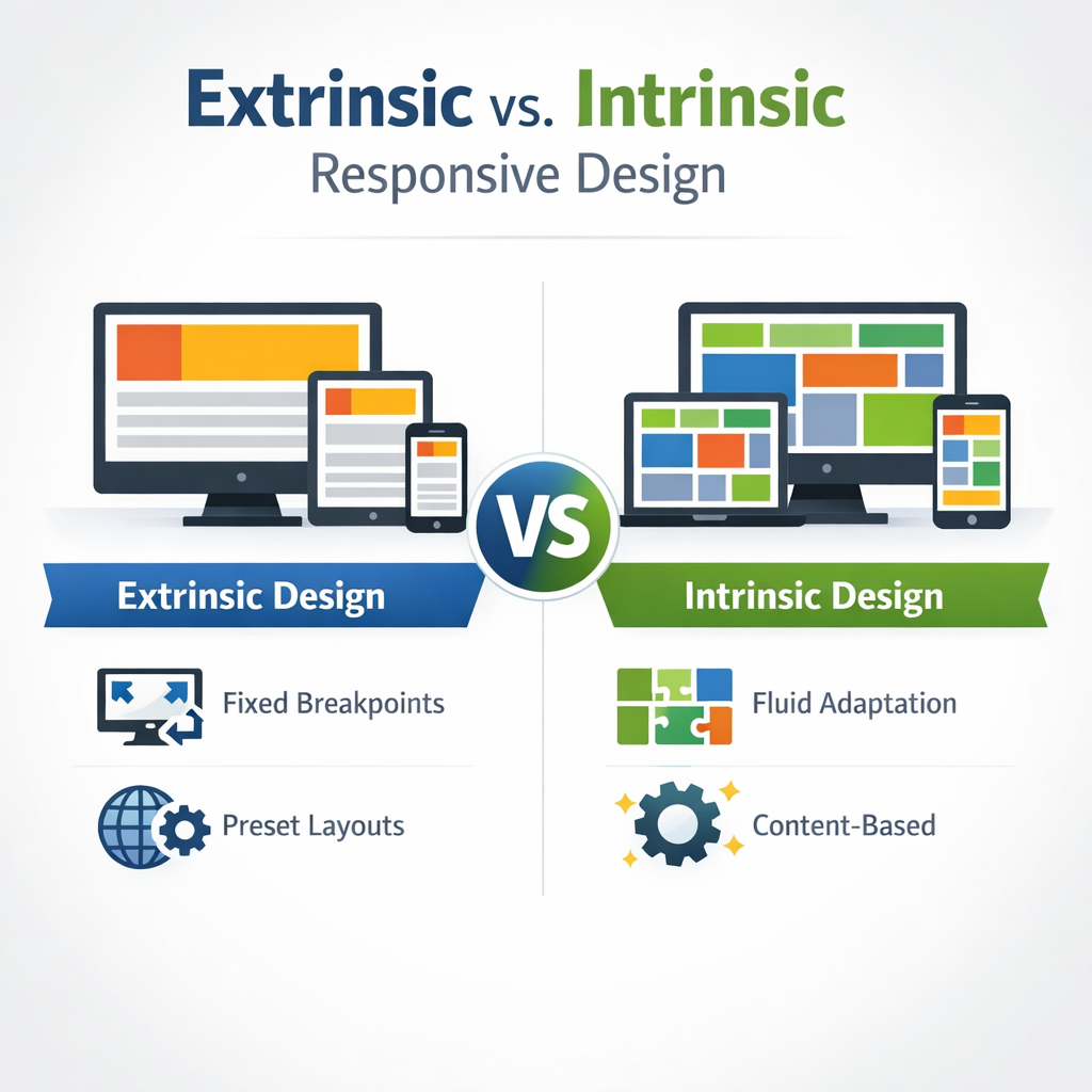
Intrinsic vs. Extrinsic Responsive Design: The Distinction That Separates Good Sites from Great Ones
This is the gap no competitor addresses, and it’s where the professional frontier of CSS actually lives right now.
Extrinsic responsive design works by exception. You write a base layout, then override it at each breakpoint:
- Base styles (likely mobile)
- Override at 768px
- Override again at 1024px
- Override again at 1280px
Every breakpoint adds a layer of exceptions. The result is a cascade of overrides that becomes increasingly difficult to maintain as a site grows.
Intrinsic responsive design, a term developed by CSS expert Jen Simmons, takes a fundamentally different approach. Modern CSS — specifically CSS Grid with auto-fill, minmax(), clamp(), min(), and max() — allows you to define layout relationships and constraints that produce contextually appropriate behavior across any viewport without a single media query being written.
Consider this CSS Grid declaration:
grid-template-columns: repeat(auto-fill, minmax(min(100%, 300px), 1fr));
This single line produces a layout that:
– Renders as a single full-width column on narrow viewports
– Automatically adds columns as space permits
– Never overflows its container
– Requires no breakpoints whatsoever
None of your competitors demonstrate this. It’s the kind of implementation that only appears when a developer has actually built with these tools rather than summarized documentation.
The practical implication for your business: intrinsically responsive layouts tend to be more resilient, require less maintenance as new devices appear, and produce fewer layout bugs in edge cases.
Container Queries: The Biggest Shift in Responsive Design Since 2010
If intrinsic design is an evolution, Container Queries are a paradigm shift. And the fact that most responsive design content either ignores them or buries them as a footnote is a genuine gap in the information available to business owners and developers alike.
The Problem Container Queries Solve
Viewport-based media queries have a structural limitation in component-driven development: a component has no knowledge of its own context within the page.
Imagine a card component — a product card, a testimonial, a service tile. With viewport media queries, you style that card based on how wide the browser window is. But the same card might be rendered:
- Full-width in a hero section
- As one of four items in a grid
- As a single item in a narrow sidebar
At the same viewport width, the card occupies completely different amounts of space depending on where it lives in the layout. Viewport-based queries can’t account for this. The result is either over-engineered workarounds or a component that looks wrong in some contexts.
Container Queries solve this by allowing a component to respond to the size of its own containing element. The card doesn’t ask “how wide is the browser?” — it asks “how wide am I right now?”
How Container Queries Work in Practice
.card-wrapper {
  container-type: inline-size;
}

@container (min-width: 400px) {
  .card {
    display: grid;
    grid-template-columns: 200px 1fr;
  }
}
When the card’s wrapper is 400px or wider, the card shifts to a two-column layout. This happens regardless of the viewport width — whether the card is in a wide hero or a narrow sidebar, the behavior is driven by available space at the component level.
The Architectural Implication
In a mature design system, Container Queries largely take over from viewport breakpoints at the component level. The practical division of responsibility becomes:
@containerqueries: Individual component behavior (card layouts, navigation items, media objects)@mediaqueries: Macro page-level decisions (overall navigation patterns, sidebar visibility, page structure)
This is a cleaner, more maintainable architecture. Components become genuinely portable — they can be dropped into any layout context and respond appropriately without modification.
The container-type Gotcha That Will Cost You Time
One real-world debugging trap that no competitor documents: you must declare container-type: inline-size on the parent wrapper element, not on the component itself. This is counterintuitive, and it creates an important side effect — defining a container establishes a new stacking context.
If your component contains position: absolute children, they will now be positioned relative to the container element rather than the nearest positioned ancestor further up the tree. This can produce unexpected visual results that are difficult to diagnose if you don’t know the cause. It’s a small detail, but it’s the kind of thing that separates an implementation that works from one that doesn’t.
Responsive Design and Core Web Vitals: The Collision Nobody Talks About
Here is where responsive design decisions stop being a matter of aesthetics and become a direct factor in your search rankings and conversion rates. Google’s Core Web Vitals — the performance metrics that influence search ranking — are frequently undermined by standard responsive design patterns. This is one of the most underreported issues in the field. For a deeper look at how technical site quality affects your organic visibility, the Small Business Technical SEO Audit: 10 Hidden Website Issues That Are Killing Your Google Rankings covers several of these performance patterns in the context of overall search performance.
Cumulative Layout Shift (CLS) and Fluid Images
The standard responsive image advice — img { max-width: 100%; height: auto; } — is correct as far as it goes. But if you don’t also declare explicit width and height attributes on the <img> element, the browser cannot reserve space for the image before it loads. The result is layout reflow: the page renders, the image loads, everything shifts. That shift is precisely what CLS measures.
This is an extremely common implementation error. Many developers follow the “responsive image” pattern faithfully and still tank their CLS scores because the second half of the solution — explicit dimension attributes — was left out.
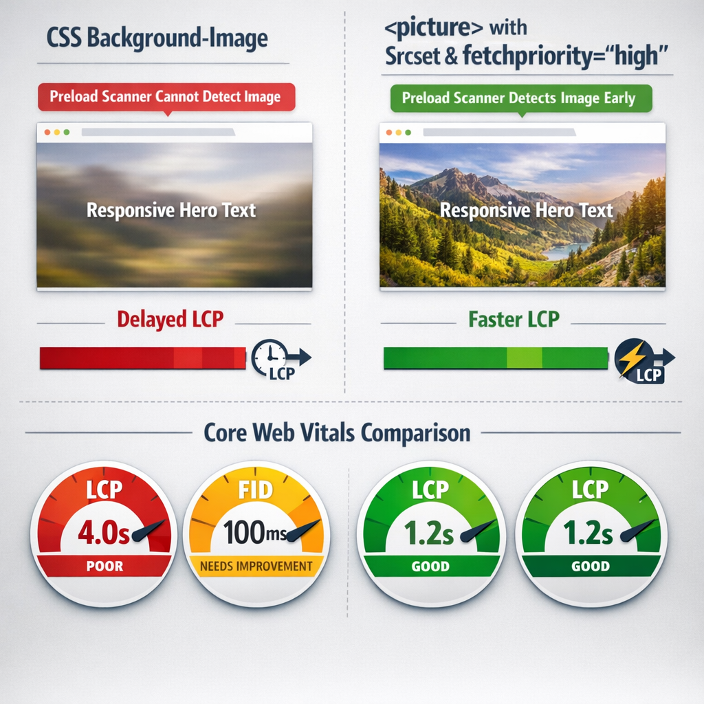
Largest Contentful Paint (LCP) and Background Images
CSS background-image is a popular technique in responsive templates because it pairs naturally with CSS sizing and positioning. The problem: background images are invisible to the browser’s preload scanner. The scanner — which speculatively fetches resources early in the loading process — only picks up <img> elements and <link rel="preload"> declarations. A hero image loaded via background-image loads later than it should, and since hero images are frequently the Largest Contentful Paint element, this directly delays your LCP score.
The authoritative solution is the <picture> element with srcset for art direction and responsive sizing, combined with fetchpriority="high" on the LCP candidate image. This signals to the browser that this specific image should be prioritized in the loading sequence.
Interaction to Next Paint (INP) and JavaScript-Driven Responsive Behavior
INP measures the delay between a user interaction and the browser’s next visual response. Heavy JavaScript-driven responsive patterns — jQuery-based show/hide for navigation, JavaScript breakpoint detection libraries, scroll-triggered layout changes — block the main thread during interaction. The user taps a menu item, the JS runs, and the browser can’t paint the response until the script completes.
The fix is moving responsive behavior into CSS wherever possible, and using modern CSS features (:has(), @container, @media) rather than JavaScript to detect and respond to layout conditions.
Responsive Design Implementation: A Direct Comparison of Approaches
Understanding the tradeoffs between different responsive implementation strategies is essential for making informed decisions about any site build or redesign. Here is a direct comparison of the primary approaches across the dimensions that matter most:
| Approach | Breakpoint Dependency | Component Portability | Performance Risk | Maintenance Overhead | Browser Support |
|---|---|---|---|---|---|
| Traditional Media Queries | High — styles tied to viewport thresholds | Low — components assume viewport context | Moderate — bloat accumulates with overrides | High — breakpoints multiply over time | Universal |
| Intrinsic CSS (Grid + clamp()) | None to minimal — layout responds to available space | High — constraints work in any container | Low — no override cascade | Low — constraints scale naturally | Modern browsers (95%+ global coverage) |
| Container Queries | None at component level | Very high — component responds to its own container | Low — CSS-native, no JS required | Low — clean separation of component vs. page logic | Modern browsers (baseline 2023, 93%+ coverage) |
| CSS Framework (Bootstrap/Tailwind) | High — framework breakpoints baked in | Moderate — portable within the framework ecosystem | Moderate to high — unused CSS unless purged aggressively | Moderate — framework updates can cascade breaking changes | Universal |
| JavaScript Breakpoint Detection | High — JS mirrors viewport conditions | Low — tightly coupled to viewport state | High — main thread blocking harms INP | High — JS must stay synchronized with CSS | Universal but at performance cost |
The picture this table paints is consistent: modern CSS-native approaches outperform legacy patterns across portability, performance, and maintenance dimensions. The caveat is browser support — and at 93–95% global coverage for Container Queries, that caveat is shrinking fast.
Mobile-First: The Right Principle, Applied With the Right Caveats
Mobile-first CSS — writing base styles for the smallest viewport and progressively enhancing for larger screens — remains sound practice. It aligns with how the majority of web traffic arrives, and it forces a discipline of prioritization that produces cleaner, faster interfaces.
But mobile-first is not without its documented failure modes, and presenting it as a universal solution without qualification is one of the ways most responsive design content oversimplifies.
What Mobile-First Doesn’t Fix
- Asset loading is not cascaded. A mobile-first stylesheet that references a large desktop background image in an
@media (min-width: 1024px)block will still cause that image to download on mobile in some browsers, even if the rule never applies. The media query controls rendering, not network requests. - Mobile-first breaks down with Container Queries. When a component responds to its container rather than the viewport, the concept of “mobile” and “desktop” states becomes contextual rather than absolute. The mental model shifts from screen-size stages to available-space thresholds.
- Content-heavy sites face genuine tradeoffs. On sites where mobile users need access to the same depth of content as desktop users, mobile-first design can create UX tensions that don’t resolve cleanly through progressive enhancement alone. These require deliberate content strategy decisions, not just CSS decisions.
Mobile-first is a valuable default orientation. It’s not a complete methodology on its own, and the most effective responsive implementations treat it as a starting principle rather than an ending answer.
Strategic Recommendations for 2026
The gap between teams that understand responsive design at a systems level and those applying surface-level patterns will continue to widen as layout complexity grows. Three specific directions deserve prioritization heading into 2026.
1. Adopt a CSS-Native Layout Audit Workflow with Utopia
Utopia is a fluid type and space calculator that generates clamp-based scales — no JavaScript, no framework dependency. For teams still managing breakpoint-driven typography and spacing, Utopia provides a structured migration path to fully fluid scales that respond proportionally across any viewport. Integrating Utopia into a design-to-code workflow forces the kind of system-level thinking that makes responsive implementation more durable and far less brittle.
Next step: Run your current type scale and spacing tokens through Utopia’s calculator and compare the output against your existing breakpoint definitions. The delta will reveal where your system is doing unnecessary work.
2. Implement Container Queries Progressively Using the @container Polyfill as a Fallback Bridge
With Container Queries now at 95%+ global support, the remaining 5% is the only legitimate obstacle to adoption. The CSS Containment polyfill maintained by GoogleChromeLabs covers the gap for teams serving audiences where legacy browser share remains measurable. This allows full Container Query adoption in production today, without a dependency on a framework abstraction layer.
Next step: Audit your analytics for browser distribution, scope the polyfill to components where component-level responsiveness matters most, and establish a deprecation trigger — a coverage threshold at which the polyfill gets removed.
3. Integrate Responsive Testing Into CI/CD With Playwright’s Viewport API
Manual responsive QA does not scale and produces inconsistent results. Playwright supports programmatic viewport configuration, device emulation, and screenshot diffing, making it the strongest current option for building automated responsive regression tests into a continuous integration pipeline. Unlike visual testing tools that operate as external SaaS platforms, Playwright runs in your existing pipeline infrastructure.
Next step: Define a viewport matrix that covers your actual traffic distribution — not just “mobile, tablet, desktop” — and write screenshot-based regression tests for your five most layout-sensitive components. This creates a living safety net for every future CSS change.
Frequently Asked Questions
Is responsive design still relevant in 2026, or have native apps replaced the need for it?
Responsive design is more relevant than ever. While native apps serve specific use cases well, the majority of digital content discovery, research, and transaction still happens through browsers across a wide range of devices. Progressive Web Apps have also blurred the line between web and native experiences, and responsive design is foundational to both. The discipline has evolved — from breakpoint-based layouts to fluid, container-aware systems — but the underlying requirement of serving one codebase across many screen contexts has not changed.
What is the difference between responsive design and adaptive design?
Responsive design uses a single fluid layout that reflows continuously across viewport sizes, typically managed through CSS media queries, flexible grids, and fluid typography. Adaptive design serves distinct, fixed layouts based on detected device or viewport categories — essentially different templates for different contexts. Responsive design is generally preferred for maintainability and performance because it avoids the overhead of maintaining multiple layout versions. However, some high-traffic platforms use adaptive techniques at the server level to deliver meaningfully different experiences to mobile versus desktop users, particularly for performance-critical paths.
When should I use CSS Grid versus Flexbox for responsive layouts?
Use CSS Grid when you are working with two-dimensional layout — when both rows and columns need to be explicitly or implicitly controlled. Grid is the right tool for page-level structure, card grids, and any layout where alignment across both axes matters. Use Flexbox when you are arranging items along a single axis — navigation bars, button groups, inline content arrangements, or components where content size should drive dimension rather than the grid template. In practice, most sophisticated layouts use both: Grid for the macro structure, Flexbox for the micro-level component arrangement within each grid area.
Are CSS Container Queries ready for production use?
Yes. CSS Container Queries have crossed the threshold of broad browser support, with coverage exceeding 95% globally as of 2025. They are supported natively in Chrome, Edge, Firefox, and Safari. For teams serving audiences where legacy browser usage remains measurable, the GoogleChromeLabs container query polyfill provides a reliable fallback. Container Queries should now be treated as a production-ready tool rather than an experimental feature, and they represent a fundamental improvement over viewport-based media queries for component-level responsive design.
How does responsive design affect Core Web Vitals and SEO?
Responsive design has a direct and significant relationship with Core Web Vitals. Cumulative Layout Shift (CLS) is particularly sensitive to responsive implementation quality — images without explicit dimensions, late-loading fonts, and dynamically injected content are common sources of layout instability that disproportionately affect mobile users. Largest Contentful Paint (LCP) is affected by how responsive images are implemented; using the srcset attribute and correctly sized image variants reduces load time for the largest visible element. Google’s mobile-first indexing means the mobile version of your responsive implementation is the version that determines search rankings, making responsive design quality directly consequential to organic visibility.
What are the most common responsive design mistakes teams make?
The most persistent mistakes fall into a few consistent patterns. First, treating breakpoints as fixed device sizes rather than as points where the layout naturally needs to change — this produces brittle systems that break between the defined breakpoints. Second, using pixel units for font sizes, which overrides user browser preferences and creates accessibility issues. Third, failing to test with real devices rather than browser emulators, which miss touch target sizing, font rendering differences, and performance characteristics. Fourth, applying media queries to individual components rather than building intrinsically responsive components using CSS Grid auto-fill, clamp(), and Container Queries. Finally, neglecting to test responsive behavior with real content at varying lengths, which is where most layout failures actually occur in production.
Conclusion
Responsive design in 2026 is not a solved problem — it is a maturing discipline with a significantly more capable toolset than existed even three years ago. The teams producing the most resilient, performant responsive implementations share a common orientation: they design systems rather than screen sizes, they test with real content and real devices rather than assumptions, and they treat CSS as an engineering layer that deserves the same rigor as application logic.
The principles covered throughout this article — fluid layouts, intrinsic sizing, container-aware components, and evidence-based tooling choices — are not academic exercises. They are practical levers that reduce maintenance overhead, improve user experience across the full device spectrum, and produce measurable gains in the performance metrics that affect both users and search visibility. If you’re working to turn that visibility into qualified leads, the SEO for Lead Generation 2026: What Actually Drives Pipeline article connects these technical foundations to the business outcomes they support.
If your team is evaluating where to focus responsive design investment, or working through a specific implementation challenge, we’re glad to help clarify the options. Explore our web design and digital marketing services to see how we approach responsive implementation as part of a complete site strategy.


