
Why Your Website Isn’t Generating Leads (And It’s Rarely What You Think)
Most business owners who come to us with a lead generation problem point to the same suspects: the contact form is buried, the CTA button needs to be bigger, or maybe the site just needs a fresh coat of paint. These things can matter. But they are almost always downstream symptoms of a deeper structural problem — and fixing them without addressing the root cause is like mopping the floor while the tap is still running.
The reality is that most business websites are built to exist, not to convert. They communicate what a company does, display some photos, and drop a phone number in the footer. That approach made sense in 2008. In today’s environment, where a visitor lands on your site having already done research, compared alternatives, and arrived with a healthy layer of skepticism, your website needs to function as an active, engineered lead generation system — not a digital business card.
This guide is built around three problems that most lead generation advice never addresses: the accumulation of friction that silently kills conversions before a visitor ever reaches your form, the psychology of trust-building that determines whether a visitor feels safe enough to hand over their contact information, and the behavioral architecture that separates websites generating a handful of weak leads from those producing a consistent pipeline of qualified prospects.
If you have already read the standard advice — add a CTA, use a pop-up, write a blog — and your results have not moved, this is the analysis you have been missing.
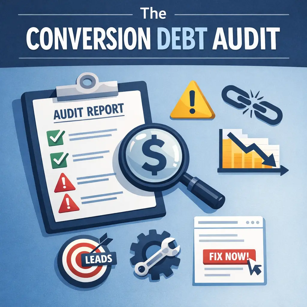
The Conversion Debt Problem: Why Small Friction Points Kill Big Results
What Conversion Debt Actually Is
Every element on your website either builds momentum toward a lead submission or it creates resistance against it. When your site has too many resistance-creating elements — a slow load time, an ambiguous headline, a cluttered navigation menu, a form that asks for information a visitor does not understand why you need — these do not simply cancel out your positive elements. They compound.
This compounding effect is what we call conversion debt. Just as financial debt accrues interest over time, conversion debt accrues resistance across the visitor’s journey. Each friction point, on its own, might cost you two or three percent of your potential conversions. Stack five or six of them together, and you are looking at a website that converts a fraction of what it should — even if your traffic numbers are healthy and your product or service is genuinely excellent.
The insidious part is that visitors rarely leave because of one obvious problem. They leave because of a feeling — a low-grade sense of uncertainty, confusion, or distrust that builds silently as they scroll. By the time they hit your contact form, that emotional deficit has already made the decision for them.
Auditing Your Website for Conversion Debt
The most effective way to identify conversion debt is to map the emotional state of a visitor at each stage of their time on your page — not just the functional elements, but the psychological experience.
Ask yourself what a first-time visitor is feeling at each of these moments:
- Second 0–3: The instant the page loads. Do they immediately understand what you do and who you do it for? Or is there a moment of cognitive work required to figure it out?
- Second 3–15: As they begin reading. Does the language speak to a problem they recognize, or does it describe your company from your own perspective?
- Second 15–45: As they scroll deeper. Are they encountering evidence that builds confidence — specific results, recognizable clients, detailed proof — or are they reading generic claims that every competitor also makes?
- Past 45 seconds: At the point of decision. Is the path to contact completely obvious and low-risk? Or does the form feel like a commitment before they feel ready?
Each of these stages represents an opportunity to either reduce debt or add to it. A headline that forces cognitive effort adds debt. A vague “industry-leading solutions” phrase adds debt. A form that asks for your phone number before you have explained why you need it adds significant debt.
The Trust Architecture of a High-Converting Website
Why “Add Social Proof” Is Incomplete Advice
The standard recommendation to add testimonials and reviews to your website is not wrong — it is just incomplete in a way that makes it almost useless as a practical directive. Not all social proof is equal, and placing the wrong kind of social proof in the wrong location can actually reduce trust rather than build it.
Here is what the data on social validation actually shows:
Proximate social proof — testimonials from clients who closely resemble your target visitor in industry, company size, or specific challenge — performs dramatically better than generic praise. A testimonial that says “Mongoose helped us grow our business” tells a skeptical visitor almost nothing. A testimonial that says “As a regional HVAC company competing against national franchises, we weren’t sure digital marketing would work for us — within six months we were ranking for every major service keyword in our area” gives a specific visitor in a specific situation a reason to believe.
The difference is recognition. When a visitor reads a testimonial and thinks that sounds exactly like my situation, trust accelerates. When they read a testimonial and think this could apply to anyone, it barely registers.
The Specificity-Trust Curve in Lead Forms
One of the most counterintuitive findings in conversion rate optimisation is that shorter forms do not always outperform longer ones. The blanket advice to “reduce form fields” misses a more sophisticated dynamic: it is not the number of fields that determines conversion rate, it is the relevance and empathy of each field.
A form that asks “What is your biggest challenge right now?” — even though it adds a field — often converts at a higher rate than a form that asks only for a name and email address. The reason is psychological: a specific, contextually relevant question signals to the visitor that you understand their situation. It demonstrates that you are not collecting contact information to add them to a generic drip sequence, but to have a meaningful conversation about something they actually care about.
This distinction reframes form optimization from a quantity problem to a relevance and empathy problem. The question to ask is not “how do I shorten this form?” but “does every question on this form make the visitor feel understood, or does it make them feel processed?”
The following table breaks down the difference between form fields that accumulate trust and those that create friction:
| Form Field | Visitor Perception | Effect on Conversion |
|---|---|---|
| “What is your biggest challenge right now?” | They want to understand my situation | Increases trust and completion rate |
| “What is your monthly budget?” (without context) | They’re screening me before talking to me | Creates resistance, lowers completion |
| “Which service are you most interested in?” | They offer options relevant to my needs | Neutral to mildly positive |
| “How did you hear about us?” | Routine and harmless | Minimal effect, but signals tracking awareness |
| “Phone number” (marked required, early in form) | They want to call me before I’m ready | Significant friction increase |
| “What does success look like for your business?” | They’re thinking about my outcomes, not their sale | Strong trust signal, increases completion |
| “Company name” (without explaining why) | Why do they need this? | Minor friction, especially for solo operators |
| “Preferred contact method” | They’ll reach out the way I’m comfortable with | Reduces friction, increases perceived safety |
The pattern is consistent: fields that make the visitor feel understood or in control build trust and improve completion. Fields that make the visitor feel evaluated or obligated add debt and reduce the likelihood they will submit.
Micro-Commitment Architecture: Engineering the Path to a Lead
Why Binary Lead Capture Fails
The vast majority of websites treat lead capture as a single event: either the visitor fills out the form or they do not. This model ignores fifty years of behavioral psychology research and produces predictably mediocre results.
The foot-in-the-door phenomenon — documented extensively in behavioral research — establishes that people who agree to a small initial request are significantly more likely to comply with a larger subsequent request. The psychological mechanism is consistency: once a person has taken an action, however minor, they experience internal pressure to remain consistent with that behavior.
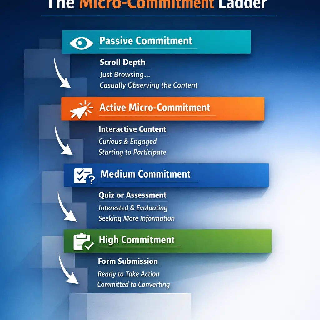
High-converting websites exploit this systematically through what we call micro-commitment architecture — a deliberate sequence of small, low-stakes actions that progressively build psychological investment and prepare the visitor to take the larger step of submitting their contact information.
Building Your Micro-Commitment Ladder
A micro-commitment ladder does not happen by accident. It is designed with intentionality, with each rung increasing in commitment level while remaining low enough in perceived risk that almost every engaged visitor will take it.
Here is how the ladder typically operates on a well-engineered service business website:
Rung 1 — Passive Commitment (Scroll Depth)
The act of scrolling is itself a micro-commitment. A visitor who has scrolled 60% down your page has already invested time and attention. They are psychologically more invested in the content than they were at second zero. This is why CTA placement at depth often outperforms above-the-fold placement for cold traffic — the visitor has not yet committed to caring when they first land.
Rung 2 — Active Micro-Commitment (Interactive Content Engagement)
Clicking an accordion to read more, expanding a FAQ, or clicking a tab to see a case study are all active micro-commitments. The visitor has taken a deliberate action that signals interest. Each of these interactions incrementally increases their sense of investment in your website and your company.
Rung 3 — Medium Commitment (Quiz or Assessment)
A one or two-question pre-form quiz — “What is your biggest obstacle to growing your business online?” — serves two purposes simultaneously. It gives the visitor a reason to engage before any contact information is requested, and it provides you with qualification data that improves your sales conversation. Visitors who complete a quiz before encountering a contact form convert at substantially higher rates because they have already invested effort and are primed to continue.
Rung 4 — High Commitment (Form Submission)
By the time a visitor has scrolled deeply, engaged with interactive content, and answered a qualifying question, they are psychologically ready to submit a form. The perceived risk of sharing their contact information is much lower because they have already demonstrated commitment through three preceding actions.
Traffic Temperature and Why One Strategy Never Fits All
The Critical Mistake of Treating All Visitors the Same
One of the most consistent gaps in lead generation advice is the failure to account for traffic temperature — the degree of awareness, intent, and readiness a visitor brings with them when they land on your site.
A visitor who typed your company name directly into a search engine is in a fundamentally different psychological state than a visitor who arrived from a blog post about general marketing tips. These two visitors require different content, different CTAs, different levels of trust-building, and different form approaches. Applying the same conversion strategy to both is the equivalent of having the same conversation with someone who has never heard of you and someone who is ready to sign a contract.
Traffic temperature typically falls into three categories that should directly inform your conversion architecture:
Cold Traffic arrives from generic search queries, social media ads, or content marketing. These visitors have low brand awareness and high skepticism. They need maximum trust-building, minimum friction, and a lead capture offer that is low-risk — a free resource, an assessment, or a no-obligation consultation — before they will engage. Sending cold traffic directly to a service page with a “Get a Quote” form is one of the most common and costly conversion mistakes business websites make.
Warm Traffic arrives from retargeting ads, email campaigns, or referral links from trusted sources. These visitors already have some awareness of your brand or have been referred by someone they trust. They need less foundational trust-building and more specific proof — detailed case studies, specific results, and clear differentiators that give them the final reasons to choose you over alternatives they are also evaluating.
Hot Traffic arrives from branded search queries, direct URL entry, or a direct referral from a known contact. These visitors are in active consideration mode. They are evaluating whether to contact you, not whether they might need your services. They need a fast, frictionless path to contact, strong final-decision reassurances (response time guarantees, clear next-step explanations), and no unnecessary barriers between their intent and your form.
Matching Conversion Elements to Traffic Temperature
| Element | Cold Traffic Approach | Warm Traffic Approach | Hot Traffic Approach |
|---|---|---|---|
| Primary CTA | Low-risk offer (free resource, quiz) | Consultation or case study CTA | Direct contact or quote request |
| Trust-building depth | Extensive — social proof, credentials, story | Moderate — specific results and differentiators | Minimal — they already trust, just reduce final friction |
| Form length | Short — name and email only, or quiz-based | Medium — qualifying questions appropriate | Can be slightly longer; visitor has high intent |
| Content priority | Problem-awareness and credibility building | Solution specificity and proof | Process transparency and response assurance |
| Micro-commitment strategy | Multiple rungs essential | Two to three rungs | One rung or none; reduce steps |
| Lead magnet relevance | High priority; reduces entry barrier | Moderate; secondary to direct CTA | Low priority; hot visitors want conversation, not content |
Understanding where your traffic is coming from — and engineering your conversion path accordingly — is a strategy-level decision that produces compounding results across every tactical optimization you make downstream.
The Headline Problem: Why Your Upstream Variables Determine Everything
Value Proposition Is the Lever, Button Color Is the Dial
A significant portion of conversion optimization effort in most businesses is spent on downstream variables: the color of a CTA button, the placement of a form, the length of a video. These elements matter at the margin. But they are dials, not levers.
Your headline and value proposition are the upstream levers that determine whether a visitor develops any motivation to convert at all. A weak headline cannot be rescued by a well-placed button. A strong, specific, problem-aware headline that speaks directly to the visitor’s situation can dramatically outperform a visually polished page built around a vague company-centric message.
The anatomy of a high-converting service business headline follows a consistent structure:
- It names the visitor’s situation or problem — not your company’s capabilities
- It signals a specific, desirable outcome — not a generic service category
- It implies a clear next step — the visitor understands what they can do right now
Compare these two headlines for a digital marketing agency:
Weak: “Full-Service Digital Marketing Solutions for Growing Businesses”
Strong: “More Qualified Leads From Your Website — Without Rebuilding It From Scratch”
The second headline does something the first does not: it enters the conversation already happening in the visitor’s mind. It acknowledges a frustration (the website is not generating leads), offers a specific outcome (more qualified leads), and reduces a common objection (we do not want to start over). That is the headline doing conversion work before a single CTA or form field is encountered.
Improving your headline is free, immediate, and often the highest-ROI change a business website can make — yet it is consistently overlooked in favor of tactical page element adjustments that operate orders of magnitude further downstream.
Final Strategic Recommendations for 2026
The gap between a website that passively exists and one that actively generates leads is not primarily a design gap or a technology gap — it is a strategic gap. The businesses that close the most leads from their websites in 2026 will be the ones that treat their site as a sales system, not a digital brochure. Three specific moves accelerate that transition.
1. Implement a Continuous Headline Testing Protocol Using AI-Assisted Copy Tools
Tools like Wynter (for message testing with real B2B audiences) and Positional (for content and conversion intelligence) allow service businesses to validate headline and value proposition changes against actual target audience responses — not guesswork. In 2026, the cost barrier to running structured copy tests has dropped significantly. There is no longer a credible reason to leave your most upstream conversion variable untested. Establish a rhythm of testing one headline variant per month, measure scroll depth and form completion as downstream signals, and let the data tell you which framing of your value proposition resonates.
2. Consolidate Your Lead Capture Around a Single, High-Value Entry Point
Audit your current site and identify how many different conversion paths you are asking visitors to choose between. If the answer is more than two, consolidate. In 2026, tools like Leadpages, Unbounce, or even a well-configured landing page within your existing CMS allow you to build a dedicated, distraction-free lead capture experience tied to your strongest offer. One specific, compelling lead magnet — a free audit, a scoped consultation, a downloadable checklist built around your client’s most pressing problem — will consistently outperform a generic contact form buried in a navigation menu. If you are evaluating what professional web design services for small businesses look like when built around conversion rather than aesthetics, the difference is immediately visible in how the lead capture architecture is structured.
3. Build a First-Party Data Strategy Before Third-Party Signal Erosion Accelerates Further
Email remains the highest-converting owned channel for service businesses, and in 2026 its strategic importance has only grown as paid platforms become noisier and more expensive. Tools like Kit (formerly ConvertKit) or ActiveCampaign give service businesses the infrastructure to build segmented, behavior-triggered email sequences that continue the conversion conversation long after a visitor leaves your site. Pair this with a strong opt-in mechanism connected to your high-value lead magnet, and you have a compounding lead generation asset that grows independent of algorithm changes or platform volatility.
Frequently Asked Questions
How long does it typically take to see results after improving a business website for lead generation?
Most service businesses begin to see measurable changes in lead volume within four to eight weeks of implementing upstream improvements — particularly headline and value proposition changes combined with a clearer call-to-action structure. Downstream adjustments like button placement or form length tend to produce smaller, slower-to-detect shifts. The fastest wins consistently come from addressing what visitors read first: the headline, the subheadline, and the primary CTA above the fold.
Do I need to redesign my entire website to generate more leads from it?
Not necessarily. A full redesign can be the right move in some situations, but it is rarely the first move that produces results. Significant lead generation improvements often come from targeted changes — rewriting the headline, adding a specific and compelling offer, simplifying navigation, or introducing a focused landing page for a core service. It is worth diagnosing the specific friction points on your current site before committing to a full rebuild.
What is the most common reason business websites fail to convert visitors into leads?
The most common failure is a mismatch between what the visitor needs to hear and what the website actually says. Most business websites are written from the company’s perspective — capabilities, history, service lists — rather than the visitor’s perspective, which is focused on their problem and whether this business can solve it. When a visitor cannot quickly identify that this website understands their situation and has a credible solution, they leave. Fixing the value proposition and the headline is the single highest-leverage correction available.
How important is website traffic compared to conversion rate for generating more leads?
Both matter, but conversion rate is the more powerful starting point for most service businesses. Doubling your traffic while maintaining a weak conversion rate produces modest gains. Doubling your conversion rate with your existing traffic produces the same lead volume increase at a fraction of the effort and expense. Traffic acquisition through SEO for lead generation, paid ads, or referrals becomes significantly more profitable once you have established that your site reliably converts the visitors it already receives.
Conclusion
Generating consistent, qualified leads from your website is not a matter of luck or ad spend — it is a matter of strategy, and strategy is exactly what Mongoose Digital Marketing is built to deliver. From SEO that puts your business in front of the right searches to conversion-focused web design that turns visitors into real inquiries, every service is oriented around one outcome: measurable growth for your business. If your website is not working as hard as it should, the next step is straightforward — Get a Free Estimate and find out exactly what it would take to change that.